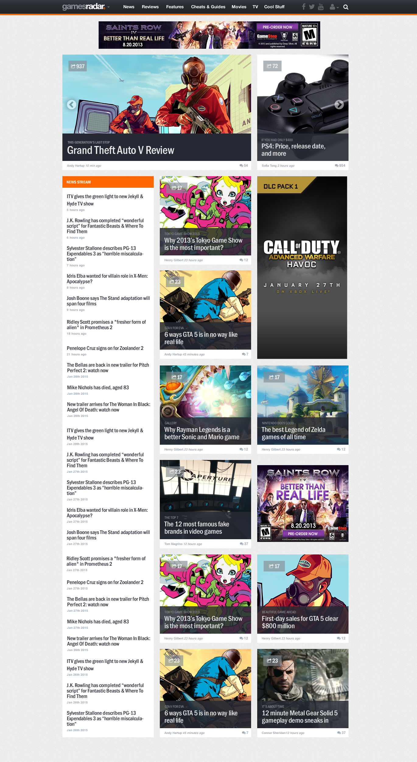
GamesRadar+ Responsive Redesign
GamesRadar+ is one of the premier destinations for video game and entertainment audiences. Launched in 2006, it became one of the largest sites for video game culture. In 2013 we saw that over 50% of our traffic was viewed on mobile devices. Here’s a look into the responsive release.
Role
Lead UX Designer
Responsibilities
Branding and Identity
User Research
Interaction Design
Visual Design
Collaborators
Joei Fiteny (Front End Developer)
Alex Afterman (Product Manager)
Bart Jaworski (VP of Product)
Randy Tano (Senior Engineer)
Deliverables
Site maps
Wireframes
Visual Design
User Research Findings
The Challenge
In 2013 GamesRadar+ was looking at over 8 million page views per month. Almost half of the users were viewing the site on mobile devices. It was time to provide an experience that served different devices and viewports. We also wanted to improve the experience on mobile while also improving page views and engagement.
Goals
- Provide a consistent GamesRadar+ experience across all devices
- Preserve advertisement placement and improve on its performance
- Create a more engaging experience with GamesRadar+ content
Approach
We chose a responsive website over an adaptive one because we wanted to provide a consistent experience across all devices not just a few. Through some quick user research though heatmaps we learned that our users were more inclined to click through articles that were supported by images.
Simplified Navigation and Architecture
GamesRadar+ numbered about 10,000 articles during the time of the responsive redesign. All of which were classified by a platform (PC, PS3, PS4, Xbox 360, Xbox One, Wii, and Wii U,). Under the platform we displayed content types (News, Reviews, Previews, Features, and Cheats & Guides). We decided to do away with a listing each platform and simplify. Heat maps and Google Analytics supported this idea. Our new navigation now looked like this (News, Reviews, Features, Cheats & Guides, Movies, TV, and Cool Stuff).

Panels
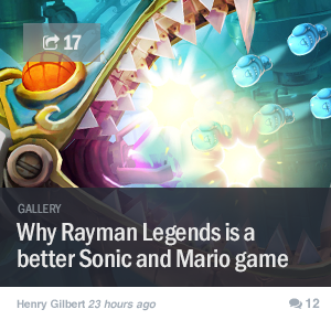
We took the panel approach to showing articles. It led us to the opportunity to contain the article within a number of pixels that allowed it to move freely within a stream. The article boxes contained a background image, headline, author, posted date, social sharing icons, comment count, and a flexible field above the headline that could be used either classify an article or support the headline. We also used this flexible field to support advertorial initiatives throughout the stream.


Ad Solutions
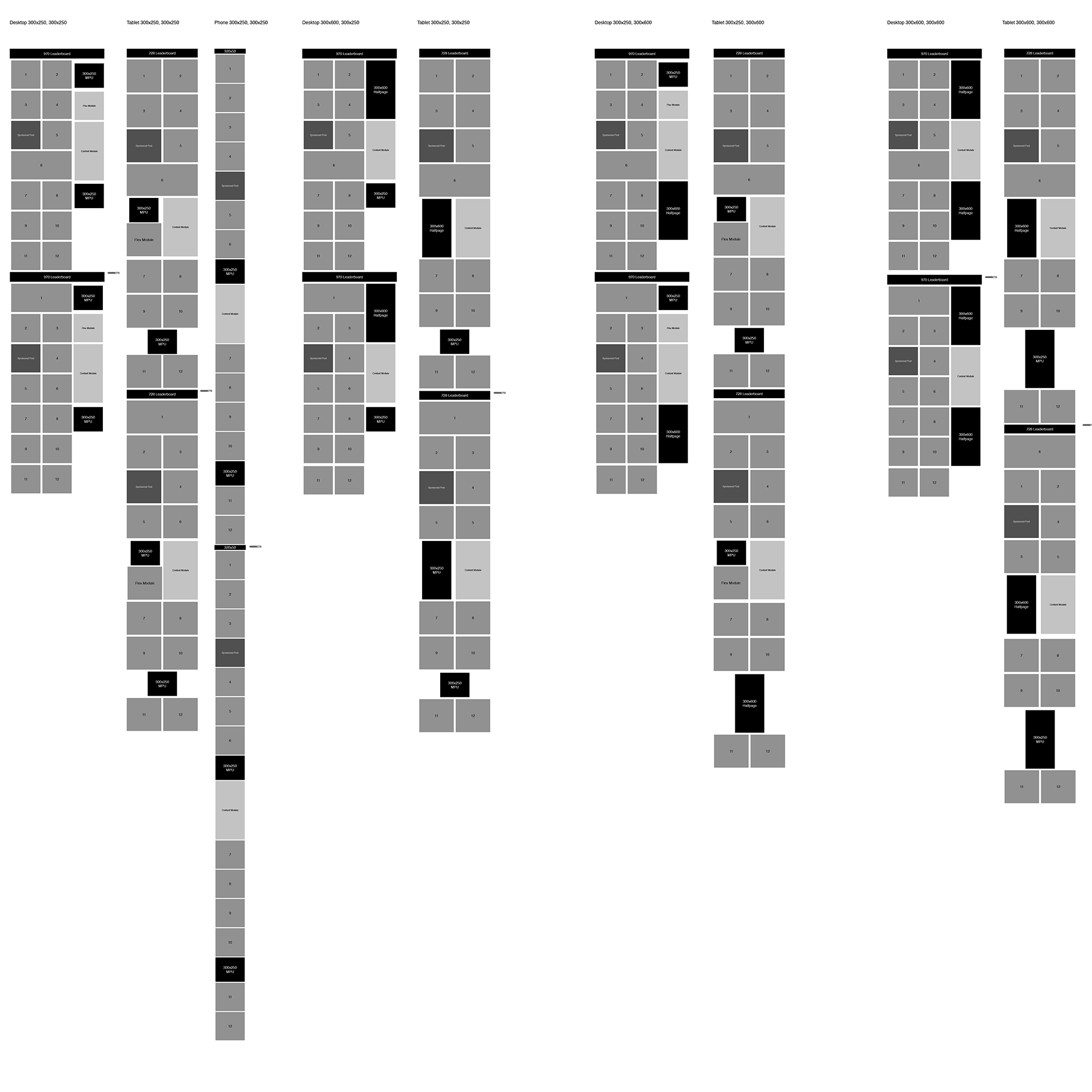
This was the most difficult challenge on the project. We served a top expandable banner ad, (970×250) accompanied by either a 300×250 MPU or 300×600 tower. We also served background skins as a takeover ad solution. On top of that was a sponsored post (advertorial) that would be placed around the stream.
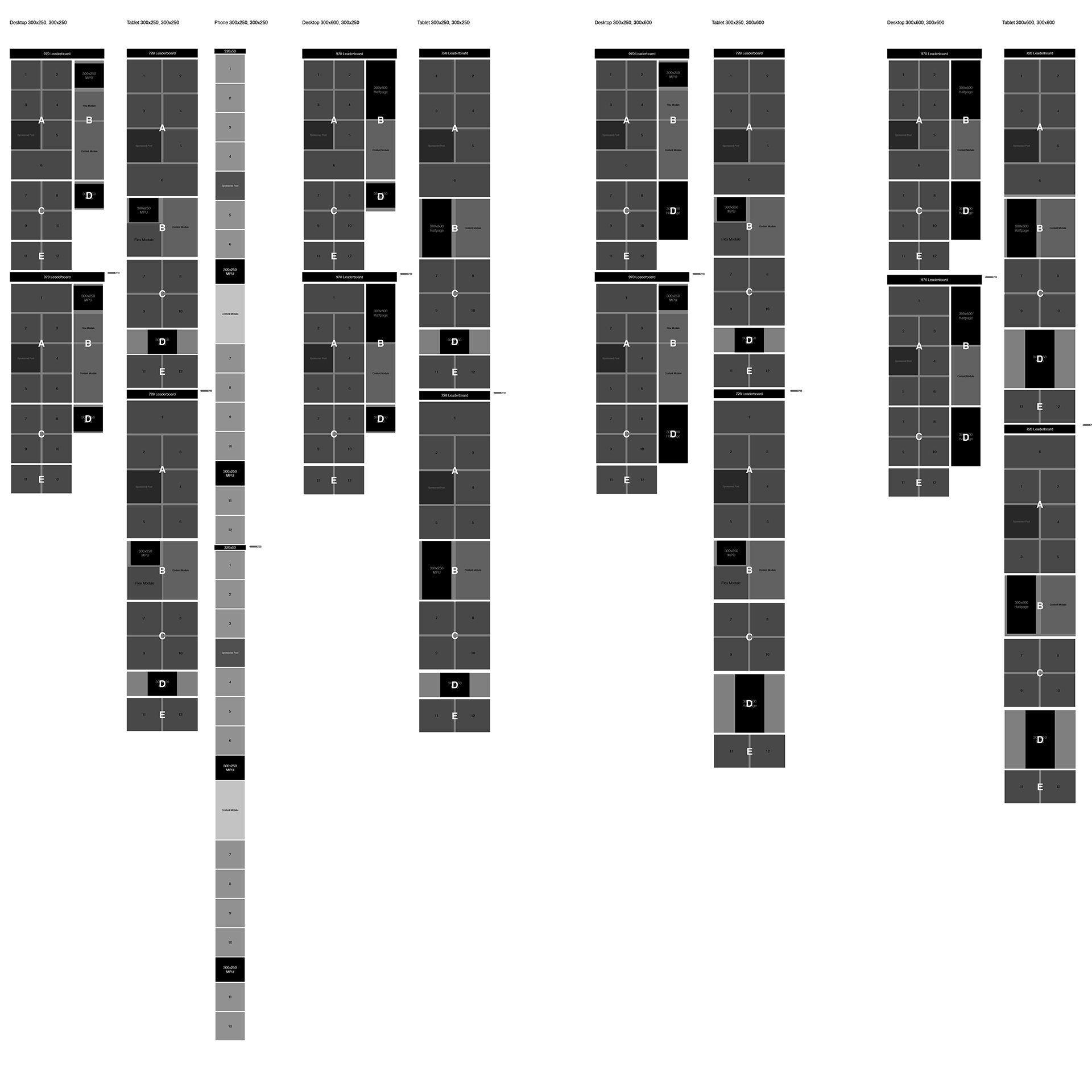
By using a 300×300 panel for our articles, we were able to distribute the ads within the stream and put together a solution that responded well on all devices. On the front end, we made a cluster of articles and ads that counted as 1 page view. During this release we also implemented an continuous stream and removed the pagination. It brought a smooth transition from page to page decreasing any friction between the user and content. This increased our page views and impressions substantially to over 80%.
Lessons
It’s true what they say. The toughest challenges bring on the greatest rewards. It was a great use case for using quantitative data to guide your design decisions. By simplifying our navigation focused our users to what they wanted the most, the content. The project required complete buy in from all of our stakeholders, editorial, engineering, sales, and marketing. Design was the glue that brought it all together.
In 2012 we were entering new territory with responsive design. Today it’s impossible to ignore responsive design. Design partnering with engineering brought this into fruition. Working closely together expanded our possibilities. Making an experience seamless and by providing better transitions for users truly enhances a product and the engagement.
