For Eyes Point of Sale System
In 2016 For Eyes approached Cog1 for a complete redesign of their POS system appropriately called… wait for it… Eyemis – originally created in 1998. We were tasked to improve the existing POS system to make a faster check out process with more efficient data and prescription entry.
Role
Lead UX Designer
Responsibilities
Project Management
Information Architecture
Interaction Design
Quality Assurance
Collaborators
Cez Raquion – Visual Designer
David Ziganay – Creative Director
Deliverables
User Flow Diagrams
Sitemaps
Visual Comps
Front End Development
How I Helped
- Administered the design process and scrum master
- Conducted interviews with sales associates
- Synthesized pain-points into functional interfaces
- Created goal oriented user flow
- Supervised interaction design and visual design
The Challenge
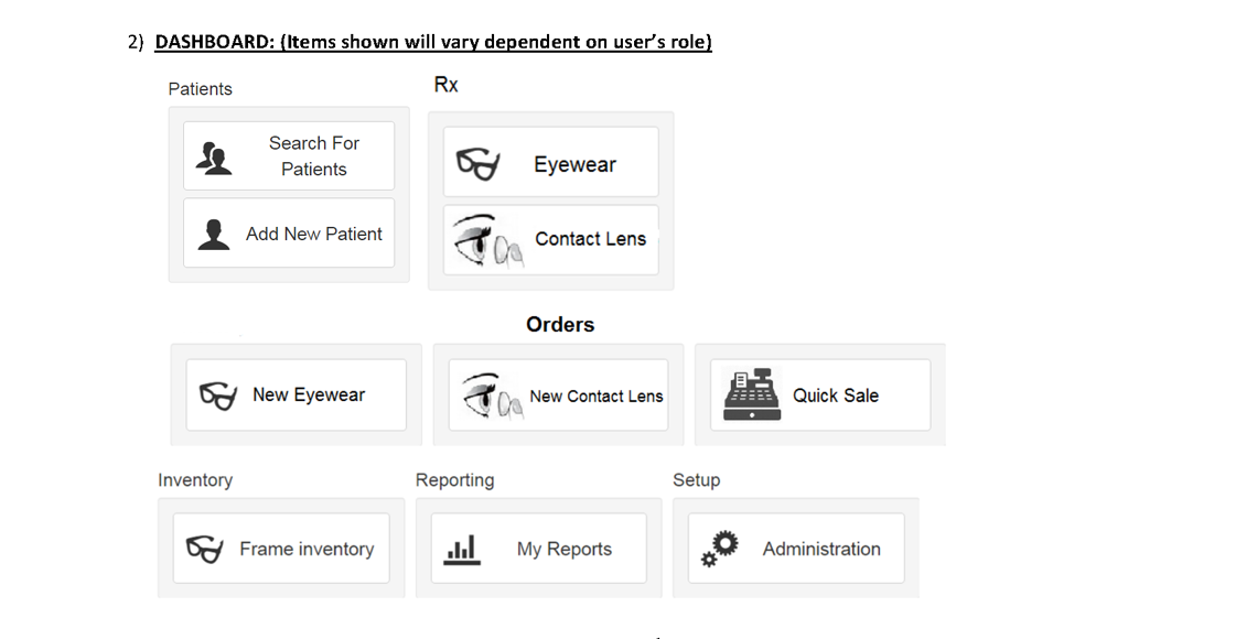
Our challenge was to redesign an aging legacy POS system attached with customer information, eyewear contact lens prescriptions, insurance information and promotion. Our goal was to design and build an efficient prescription interface, faster checkout and a stable application.
The First Step
Our first step was an in store visit to a For Eyes in San Francisco. It was frightening to see an 18 year old application still being used. We needed to understand how the current application worked. Within the first 5 minutes of the demo we knew we had a challenge and bigger opportunity. We logged all the pain-points that the sales associates were facing. Here were a few.
- Rigorous checkout process
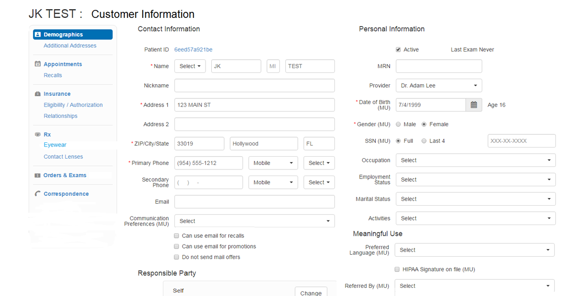
- Redundant data entry (multiple entry of customer address)
- No system or notification of error handling
- Need for Quick Sale checkout. Sales associates had to enter customer information for non prescription purchases such as screen wiper and lens cleaner
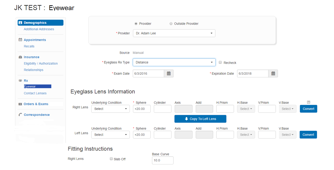
- Correct validation on prescription input fields
Competitive Analysis
Next, we obtained a list of similar optical POS systems that served their needs. We needed to reveal their strengths and weaknesses so that we could create the best possible outcome in our own application.
Establishing a Flow
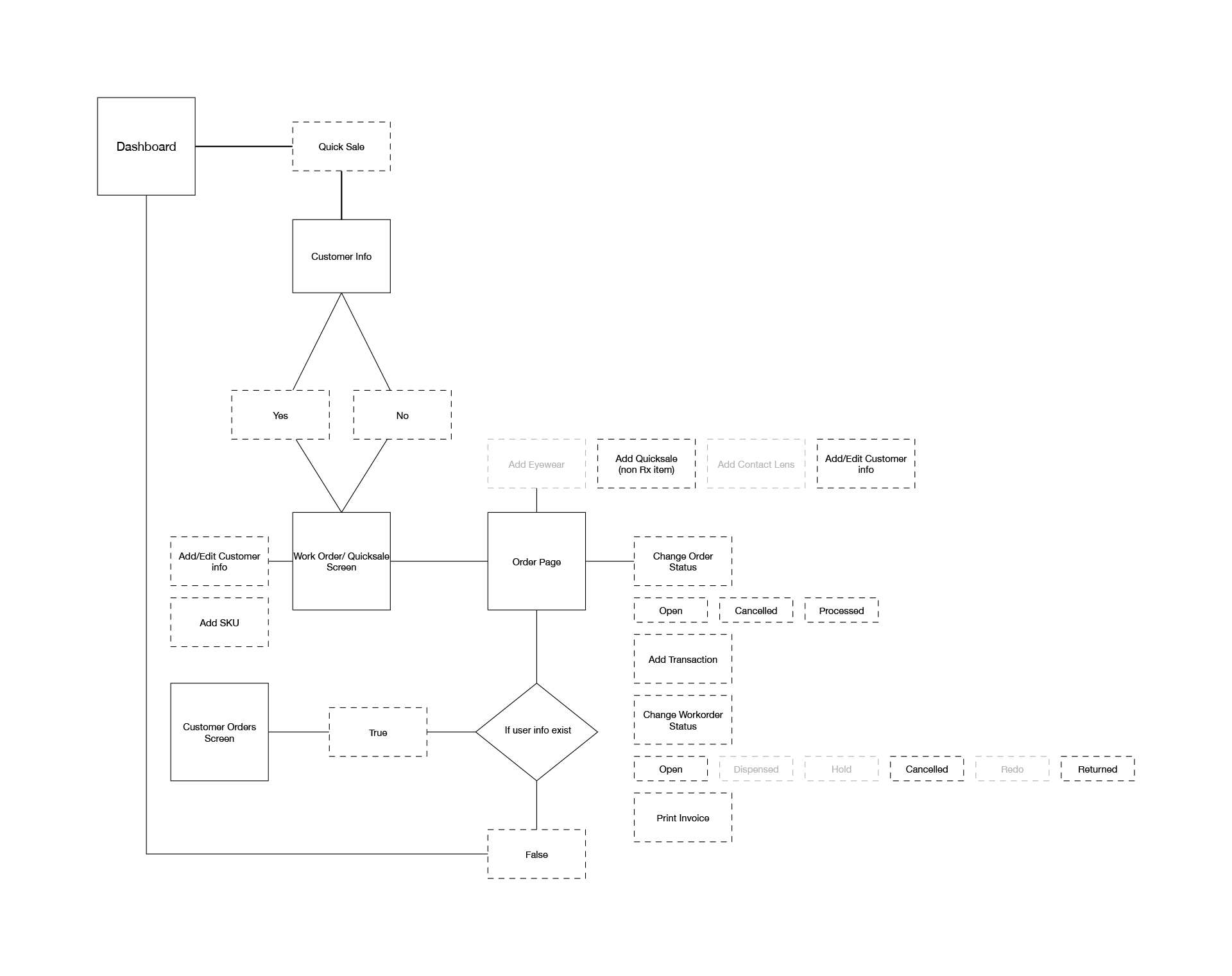
Understanding and mapping out the entire user journey can uncover issues and also create opportunities. We approached this with individual use cases with empathy. Here is where we defined a goal for each journey – eyewear, contact lens, and quick sale order. It was also common to accommodate repeat customers and the ability to edit their prescriptions, redos, address and insurance information.
-
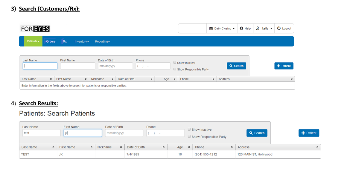
Customer Information
-
Insurance Information
-
Enter Prescription
-
Place Order
Design and Development
It was time to go lean and mean. We skipped the wireframing process to save on hours. You could say this was part of the challenge however whiteboard sketches did the trick. In addition, For Eyes provided screenshots of their application and highlighted mandatory input fields. We kicked off visual design with a style tile to set up the framework of our interface.
Design sprints were created on a weekly basis and it was my responsibility to help run the design portion of the kanban board. User stories were graphed alongside each journey. Subtasks were created ensuring we had the correct goals and input fields of each page. We presented each comp followed by a Q&A session with our client to go over changes and concerns.
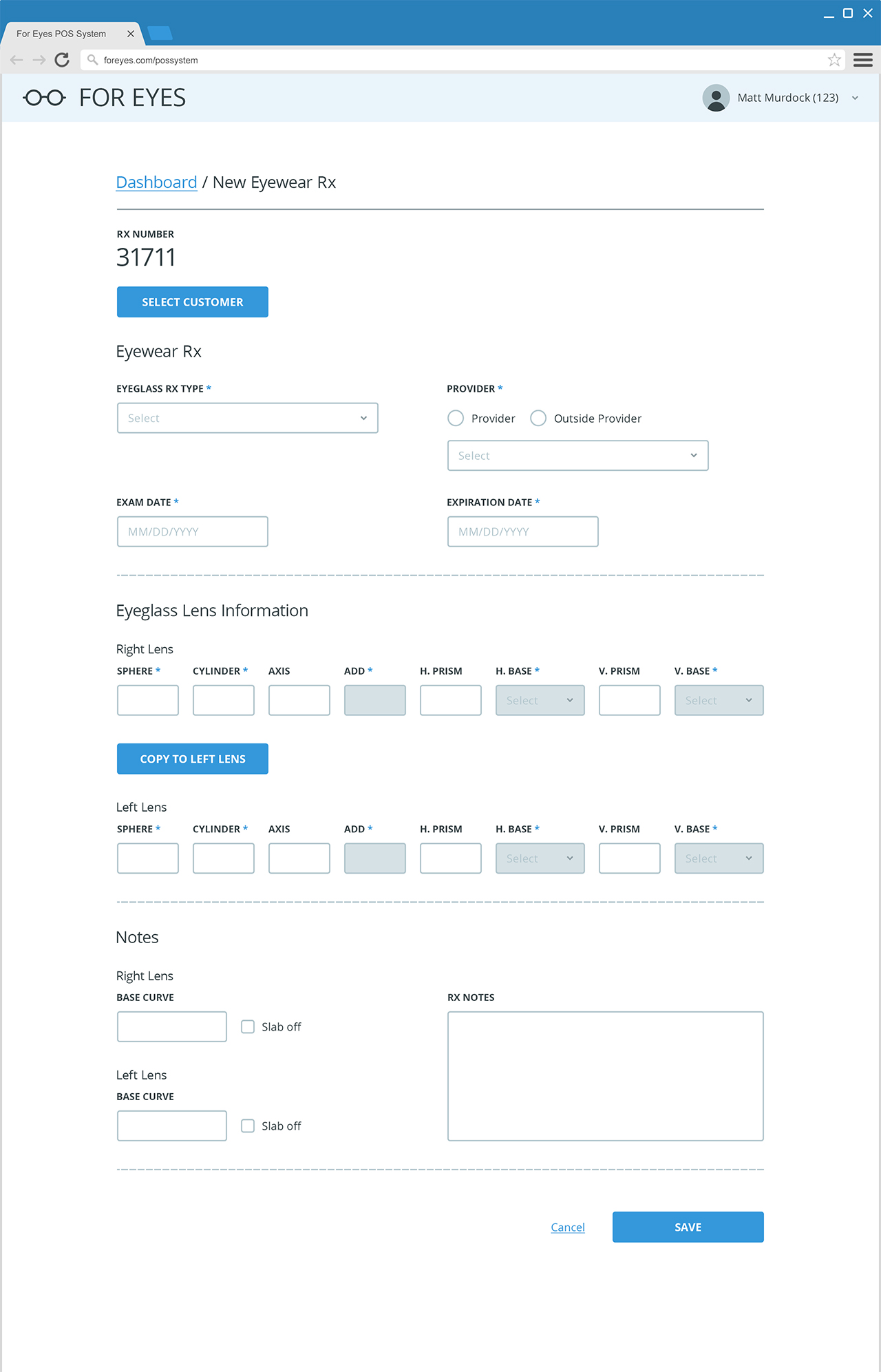
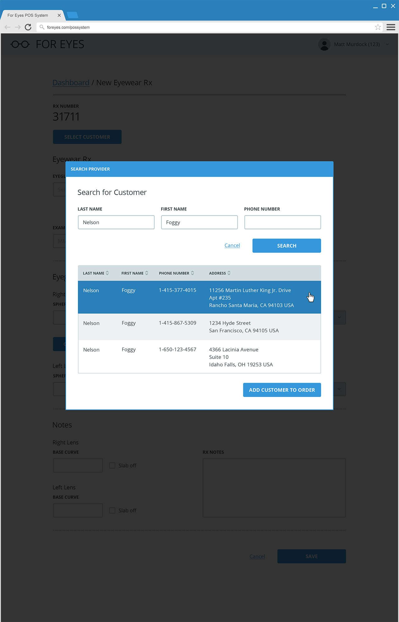
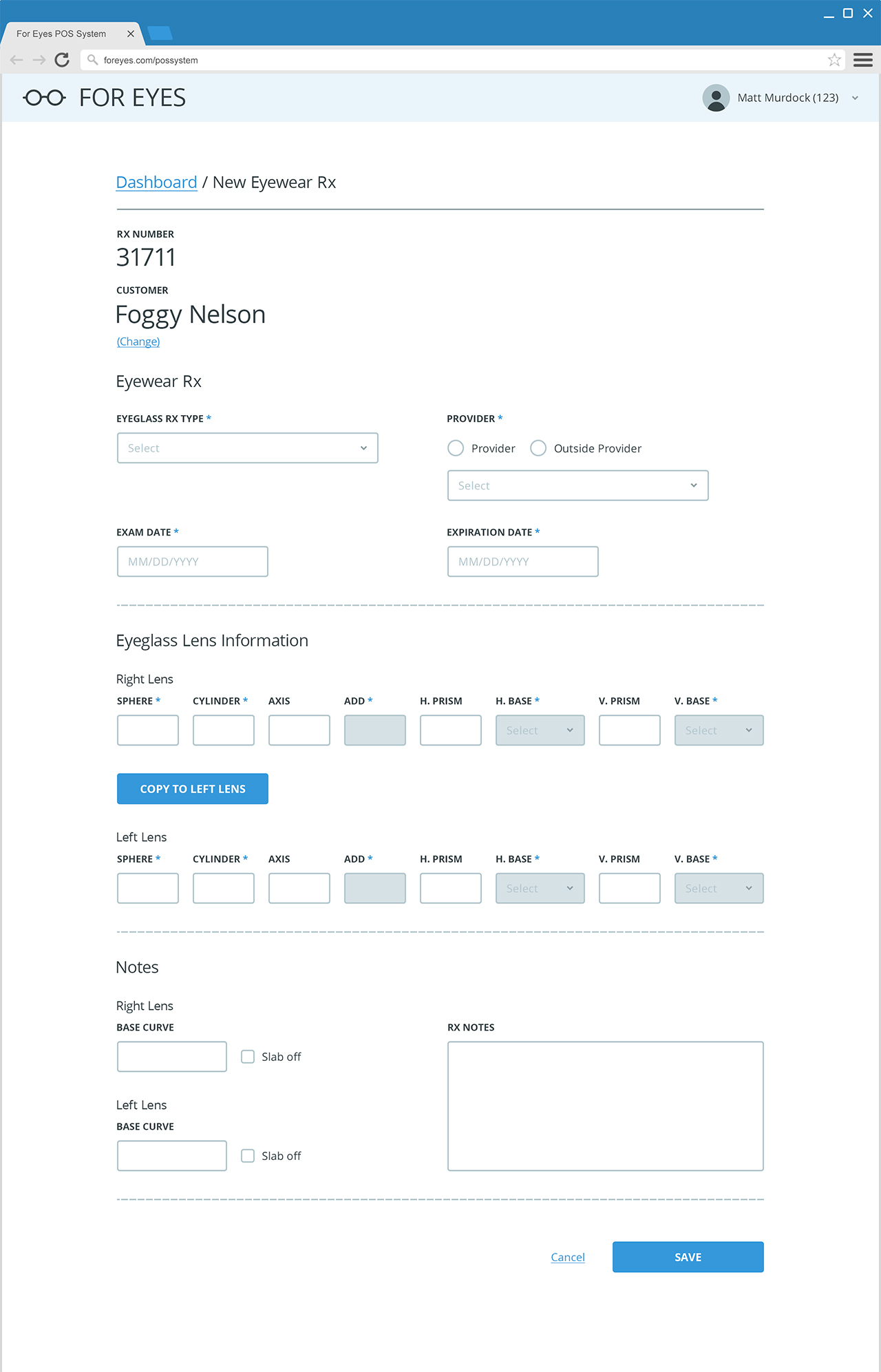
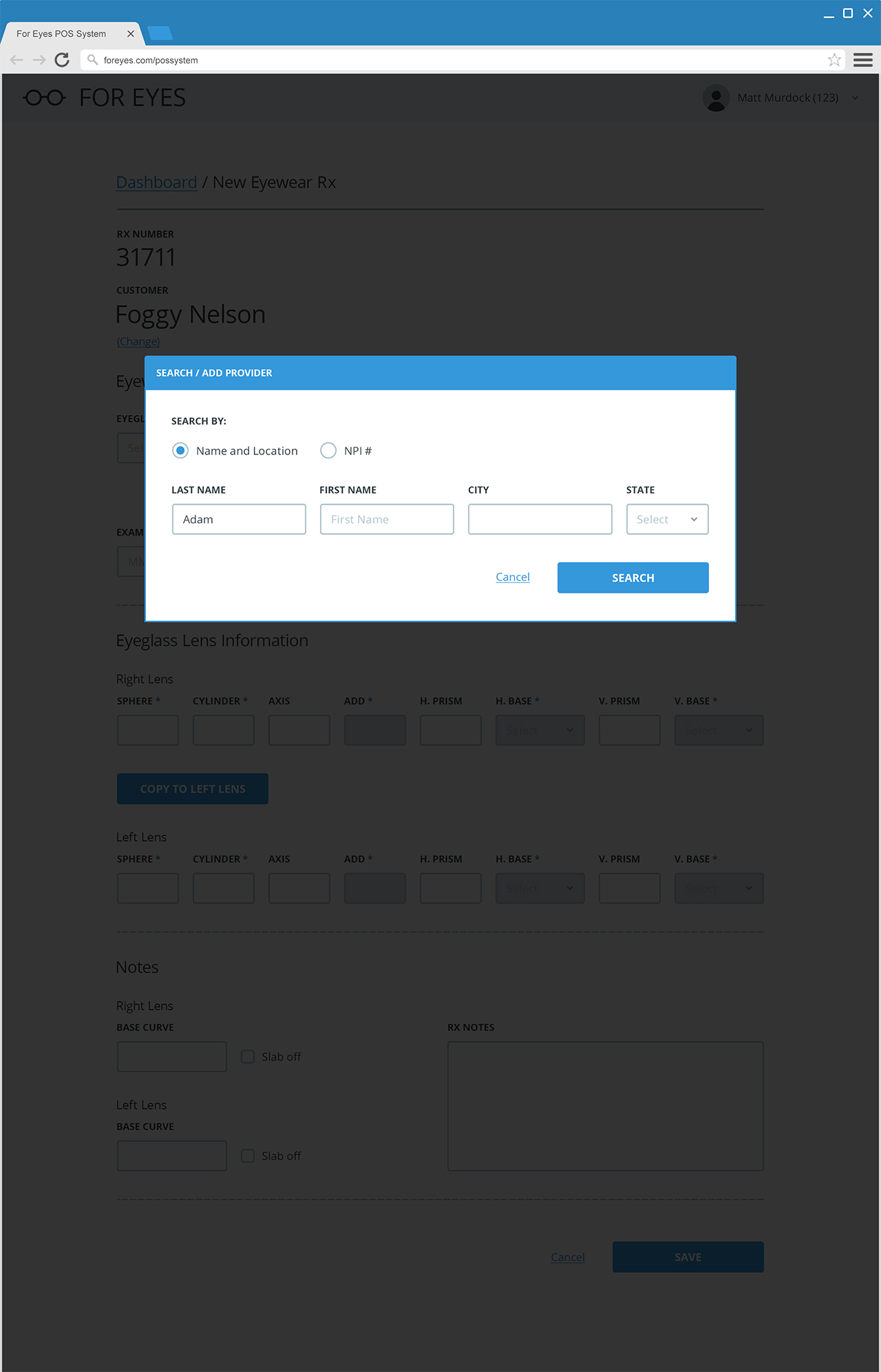
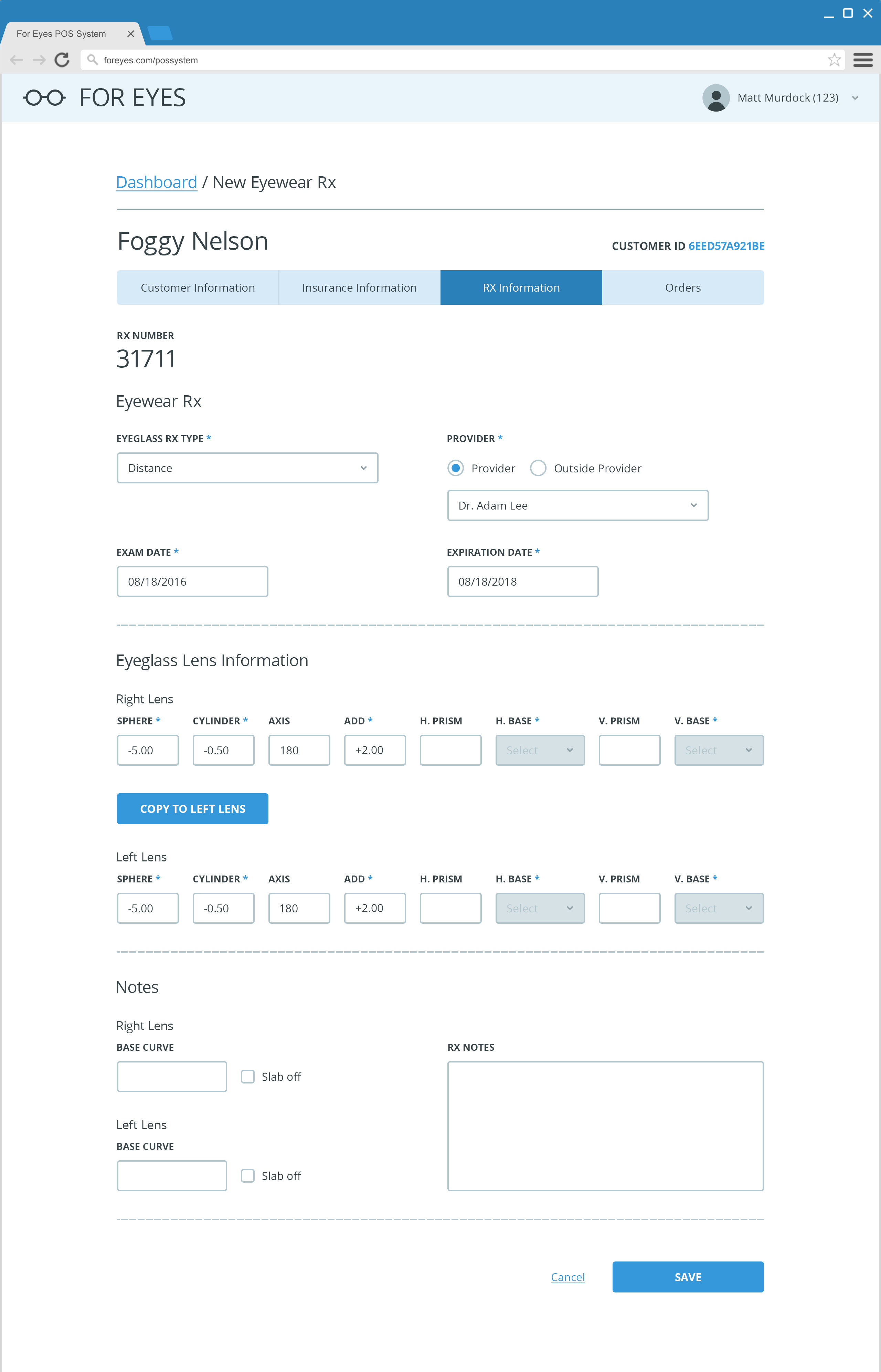
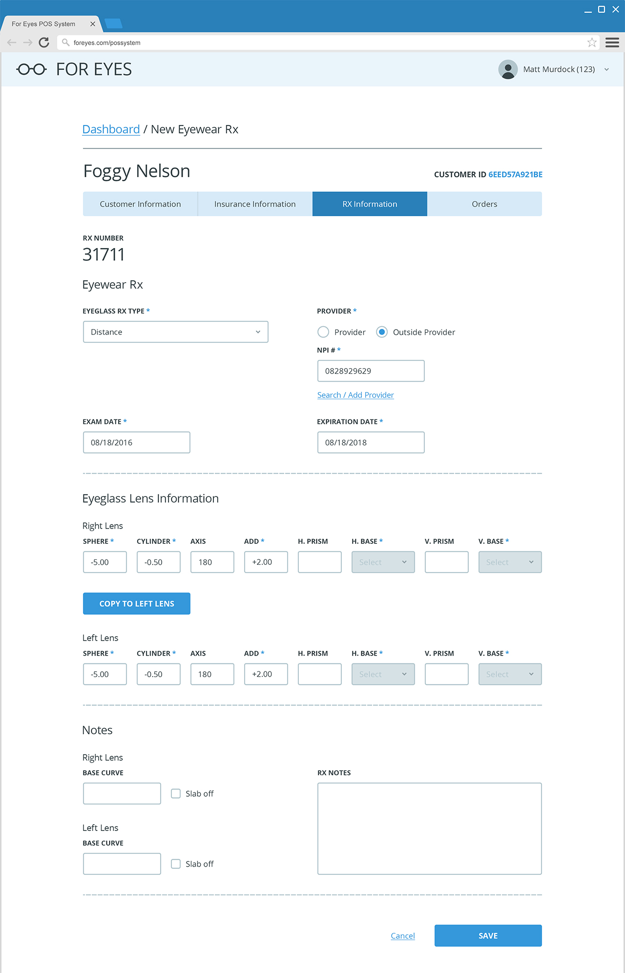
With a sizable web application as this was, the complexity was often overlooked. We were dealing with stock keeping units, prescription information and customer information that all had to fuse together to form an order. Below is the process of entering a customers insurance information.

Learning
Though it was obvious to our clients, it did take some time for our team to grasp. It wasn’t until we were invited to the factory that things became clear. We were taken through the process of how a pair of glasses were made. We were able to represent an input field with a tangible element on the production line. The process was explained to us by an optometrist turned director of production.
From there we were able to synthesize the process of an eyewear order and embody empathy through experience not through a persona. We were able to step back from a screen and experience the product from a different perspective. The visualization activated our creative abilities as designers and developers and influenced our final product. It was the most valuable experience on the project. Sometimes is not about how exquisit an interface functions but how the method you use to create it.
